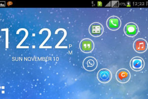
 Not all Android launchers radically change the way the system is laid out, but Smart Launcher 2 certainly does. It makes one’s main home screen something that looks more like a lock screen with six icons giving one access to the most commonly used apps such as the browser, music player and so on.
When one starts up this app, it asks which installed apps you want to use on the lock screen. Crucially, this home screen looks pretty good.
The rest of the apps will split up into six categories within the main apps menu, which also looks different from the norm. Although Smart Launcher may seem progressive, it makes one’s smart phone a bit more like using an old features phone. All the flicking about with just a single tap of an icon gives an irritation of too much light.
As such it will be necessary for one to reduce the light intensity of the phone. Smart Launcher 2 will remove the slaggy look on one’s phone but also make navigation through the phone easier.


